Components
Tailwind CSS Avatar - Madhuranjan UI
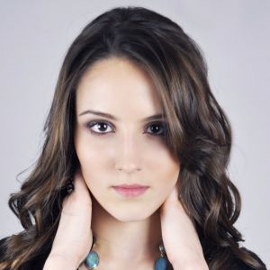
Easily integrate our Tailwind CSS avatar component to display user profile images beautifully. Built entirely with Tailwind CSS, no additional dependencies required. Just copy and paste into your project and start using it instantly.
Type of Avatars
Our Avatar Collection includes 10+ variations, such as simple avatars, bordered avatars, glowing avatars, gradient avatars, avatars with badges, and much more. These styles ensure flexibility for different UI/UX requirements.
 3
31<div class="flex flex-wrap gap-6 p-6 bg-gray-50 dark:bg-gray-900 justify-center">
2 <img
3 class="w-16 h-16 rounded-full border-2 border-gray-300"
4 src="https://i.pravatar.cc/150?img=1"
5 alt="User Avatar"
6 >
7
8 <!-- {/* 2. Hover Scaling Effect */} -->
9 <img
10 class="w-16 h-16 rounded-full border-2 border-green-500 transition-transform duration-300 hover:scale-110"Avatar With Text
Our Avatar with Text component allows you to display user names, roles, and statuses alongside profile images. It includes status indicators, notification badges, and hover effects to make user interactions more dynamic.
1<div class="flex flex-wrap gap-3 md:gap-6 md:p-6 py-5 justify-center items-center bg-gray-50 dark:bg-gray-900">
2      <!-- {/* 1. Simple Avatar with Name & Role */} -->
3      <div class="flex items-center space-x-3">
4        <img
5          class="w-12 h-12 rounded-full"
6          src="https://i.pravatar.cc/150?img=3"
7          alt="User Avatar"
8        />
9        <div>
10 <p class="text-lg font-semibold text-gray-800 dark:text-white">Overlapping Avatar
Overlapping Avatars are perfect for group user displays or team sections. These avatars create a stacked effect with smart spacing, hover effects, and elegant alignment, making them ideal for social or collaborative interfaces.
1<div class="flex flex-wrap items-center justify-center gap-10 bg-gray-50 p-5 dark:bg-gray-900">
2  <!-- 1️⃣ Stacked Avatars with Overlapping Effect -->
3  <div class="flex items-center space-x-[-10px]">
4    <img class="h-12 w-12 rounded-full border-2 border-gray-800 shadow-lg dark:border-white" src="https://i.pravatar.cc/150?img=1" alt="User 1" />
5    <img class="h-12 w-12 rounded-full border-2 border-gray-800 shadow-lg dark:border-white" src="https://i.pravatar.cc/150?img=2" alt="User 2" />
6    <img class="h-12 w-12 rounded-full border-2 border-gray-800 shadow-lg dark:border-white" src="https://i.pravatar.cc/150?img=3" alt="User 3" />
7    <img class="h-12 w-12 rounded-full border-2 border-gray-800 shadow-lg dark:border-white" src="https://i.pravatar.cc/150?img=4" alt="User 4" />
8    <div class="flex h-12 w-12 items-center justify-center rounded-full border-2 border-gray-800 bg-gray-700 text-sm font-bold text-white dark:border-white">+99</div>
9  </div>
10Different Shape & Size
Avatars are available in multiple sizes (Small to Large) and unique shapes like Circle, Square, Hexagonal, Diamond, and Rounded Rectangle. These variations enhance UI design, offering a flexible approach for different design needs.
1<div class="flex flex-wrap items-center justify-center gap-14 bg-gray-100 dark:bg-gray-900 p-8">
2      {/* <!-- 1️⃣ Square Avatars (Different Sizes) --> */}
3      <div class="flex gap-3">
4        <img
5          class="h-10 w-10 border-2 border-white"
6          src="https://i.pravatar.cc/150?img=1"
7          alt="Avatar"
8        />
9        <img
10 class="h-16 w-16 border-2 border-white"DropDown Avatar
Our Dropdown Avatar component provides an elegant user profile dropdown menu. It includes Profile, settings, and logout buttons, with smooth animations and dark mode compatibility.
1<div class="relative">
2  <!-- Avatar Button -->
3  <button class="peer h-12 w-12 cursor-pointer rounded-full border-2 border-white transition-all duration-300 hover:scale-110 focus:ring-4 focus:ring-blue-500/50 dark:border-gray-700 dark:focus:ring-blue-700/50">
4    <img src="https://i.pravatar.cc/150?img=1" alt="User Avatar" class="h-full w-full rounded-full" />
5  </button>
6
7  <!-- Dropdown Menu -->
8  <div class="invisible absolute left-0 mt-2 w-56 -translate-y-2 transform rounded-lg bg-white opacity-0 shadow-xl transition-all duration-300 peer-focus-within:visible peer-focus-within:opacity-100 peer-hover:visible peer-hover:translate-y-0 peer-hover:opacity-100 dark:bg-gray-800">
9    <!-- Header -->
10    <div class="rounded-t-lg bg-gradient-to-r from-blue-500 to-purple-500 p-2 dark:from-blue-600 dark:to-purple-600">